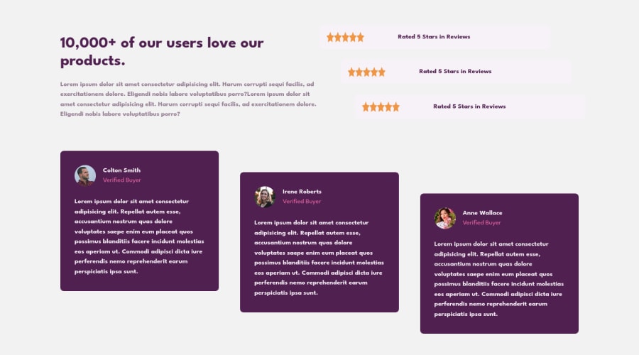
Design comparison
Community feedback
- @NIk22517Posted about 2 years ago
Hello @atmcmustafa, Congratulations on completing this challenge!
Nice code and nice solution! You did a good job here putting everything together. I’ve some suggestions for you:
You did really good work here putting everything together, something you can improve its your code HTML markup and semantics. You can replace the
<div>that wraps each card with<article>you can wrap the paragraph with the quote with the tag<blockquote>this way you'll wrap each block of an element with the best tag in this situation. Pay attention that<div>is only a block element without meaning. Change thebackground-colorof thestar ratingso it look good and also change thefont-sizeorfont-weight✌️ I hope this helps you and happy coding!
Marked as helpful0 - @correlucasPosted about 2 years ago
👾Hello @atmcmustafa, Congratulations on completing this challenge!
Great code and great solution! I’ve few suggestions for you that you can consider adding to your code:
You’re in the right track I can see that you’ve used the majority semantic tags possible for this challenge, the only block you’ve missed is the paragraph containing the
quote textyou can improve the accessibility there using<blockquote>to indicate to screen readers that the content inside that paragraph is a quote.✌️ I hope this helps you and happy coding!
Marked as helpful0
Please log in to post a comment
Log in with GitHubJoin our Discord community
Join thousands of Frontend Mentor community members taking the challenges, sharing resources, helping each other, and chatting about all things front-end!
Join our Discord
