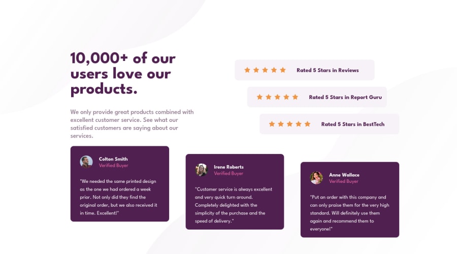
Design comparison
Solution retrospective
Will take any feedback
Community feedback
- @correlucasPosted over 2 years ago
👾Hello @Mikssxed, Congratulations on completing this challenge!
Nice code and nice solution! You did a good job here putting everything together. I’ve some suggestions for you:
You’re in the right track I can see that you’ve used the majority semantic tags possible for this challenge, the only block you’ve missed is the paragraph containing the
quote textyou can improve the accessibility there using<blockquote>to indicate to screen readers that the content inside that paragraph is a quote.✌️ I hope this helps you and happy coding!
Marked as helpful1 - @Deepanshu-5288Posted over 2 years ago
Hello @Mikssxed, It's really looking good just a little suggestion, When the screen size is between desktop and tablet unwanted cropping is happening always make sure that at every size of a screen all the contents are structured correctly and vertically also on desktop screen since its a one-page website so try to avoid scrolling and align such that scrolling is not happening. For a better understanding of what I am trying to say you can check the below solution : https://www.frontendmentor.io/solutions/responsive-socialproofsectionmaster-d3oq-ef3LW
Feel free to ping me on Slack.
I hope it helps you.
Thanks,
Marked as helpful1
Please log in to post a comment
Log in with GitHubJoin our Discord community
Join thousands of Frontend Mentor community members taking the challenges, sharing resources, helping each other, and chatting about all things front-end!
Join our Discord
