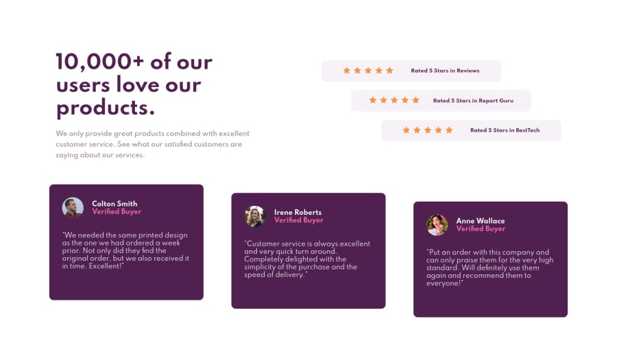
Design comparison
SolutionDesign
Solution retrospective
Any suggestions/feedbacks are welcomed !
Community feedback
- @muhammadshajjarPosted about 3 years ago
Hi, Nice work!
some suggestions would be
- For the testimonial quote, I recommend to use block-quote for more semantic HTML check out this for information
- Try to add
max-widthto a body or make a container class that wraps your all content, by adding it you can control your content from growing too much on larger viewports, it is first stepped to responsiveness in my opinion. It would save your from this - I appreciated for leaving alt blank for decorative images but it would be good practice to use
aria-hidden="true"orrole="presentation". So screen reader ignore those - You should need to add some semantic markers to designate sections of the page as the header, navigation, main content, and footer e.g:
<main>
<section>
</section>
</main>
<footer>
</footer>
Marked as helpful0@RutC9Posted about 3 years ago@muhammadshajjar thank you for your inputs, will look into this .
0
Please log in to post a comment
Log in with GitHubJoin our Discord community
Join thousands of Frontend Mentor community members taking the challenges, sharing resources, helping each other, and chatting about all things front-end!
Join our Discord
