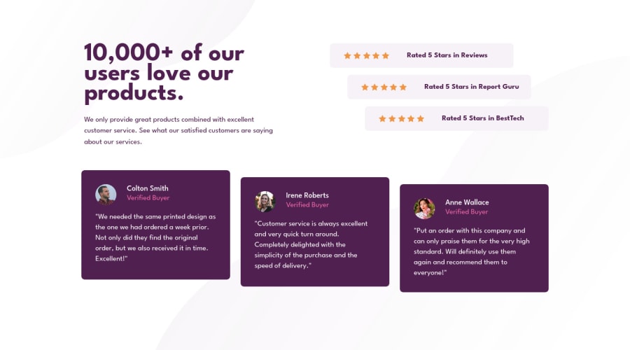
Design comparison
SolutionDesign
Solution retrospective
Mobile first design.
Please log in to post a comment
Log in with GitHubCommunity feedback
- @catherineisonline
Looks nice! I would add a bit of margin at the button on the mobile version because it's too close to the bottom
- @SinisaVukmirovic
Hello!
Everything looks good to me.
Clean and tight code, using new like for each attribute in HTML tags, very readable. Mobile first approach. Nothing I would change.
Keep it up in the future projects!
Join our Discord community
Join thousands of Frontend Mentor community members taking the challenges, sharing resources, helping each other, and chatting about all things front-end!
Join our Discord
