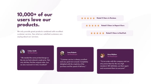
Social Proof Section

Solution retrospective
I'm proud that its been 5 months and I'm still coding.
I need to take less time to do projects, I did feel a little burned out but that's no excuse, I just got a little bit lazy.
What challenges did you encounter, and how did you overcome them?This project took me a bit of time, I struggled with order of things - when I had desktop version done, I didn't really add the div container and had to redo the whole structure. When I added the div, there is extra space on the bottom of the page that I don't know how to remove - any help would be much appreciated.
What specific areas of your project would you like help with?Div removal, white space on the bottom of the page. Any other suggestions are much appreaciated.
Please log in to post a comment
Log in with GitHubCommunity feedback
No feedback yet. Be the first to give feedback on Dan P.'s solution.
Join our Discord community
Join thousands of Frontend Mentor community members taking the challenges, sharing resources, helping each other, and chatting about all things front-end!
Join our Discord