

Design comparison

Solution retrospective
great challenge, did it exclusively with flex and didn't feel easy, not familiar with grid but i think ideal solution could be a combination of the two.
solution not perfect since i did not want to spend too much time on it, but got all critical parts working.
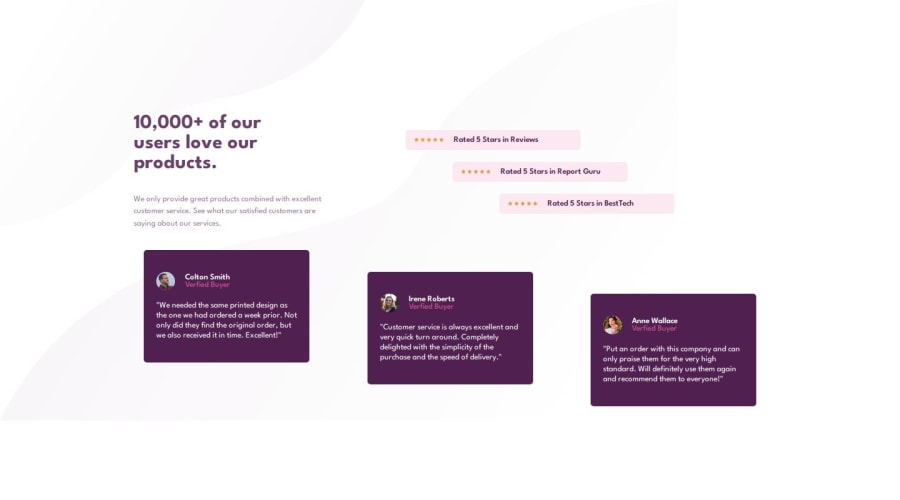
What specific areas of your project would you like help with?the 2 testimonials at either end in the bottom container are not flush against the container, there is a tiny gap, this is from justify-content: space-around. but without space-around flex wrap results with odd placement of testimonials. how do i get rid of the gap.
my breakpoints were not exactly reflective of viewport size so i had to estimate few times, not sure why.
background image for mobile has is not available on scroll.
also i am not sure how to stop flex from growing beyond 1440px.
these or other feedback/suggestions are welcome!
Community feedback
Please log in to post a comment
Log in with GitHubJoin our Discord community
Join thousands of Frontend Mentor community members taking the challenges, sharing resources, helping each other, and chatting about all things front-end!
Join our Discord