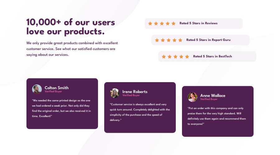
Design comparison
Solution retrospective
I am very proud of having completed this challenge, I spent a couple of minutes analyzing how to do the cards section, and I really liked how it turned out in the end.
Estoy muy orgullosa de haber completado este reto, estuve un par de minutos analizando cómo hacer la sección de tarjetas, y me gustó mucho cómo quedó al final.
What challenges did you encounter, and how did you overcome them?I don't know if it was a good idea to give some parts a relative position to have that effect, but I'm still happy with the result obtained.
No sé si fue buena idea darle una posición relativa a algunas partes para tener ese efecto, pero aun así estoy contento con el resultado obtenido.
What specific areas of your project would you like help with?Cards section
Community feedback
- @VCaramesPosted 3 months ago
Hey there @Saul-Gustavo! 👋 Here are some suggestions to help improve your code:
- Do not do this;
<div class="star"></div> <div class="star"></div> <div class="star"></div> <div class="star"></div> <div class="star"></div> </div>
As it is bad for accessibility, since all the user of screenreader will hear is "New line" over and over.
- This
<section class="cards">
is just anotherdiv
; no need for thesection
since the entire component is asection
as implied by the challenge name.
- For the testimonials, it is best to to wrap each individual testimonial component in a
figure
element, the individuals information should be wrapped in afigcaption
element and lastly, the testimonial itself should be wrapped in ablockquote
element.
Code:
<figure> <figcaption></figcaption> <blockquote></blockquote> </figure>
More Info:📚
- For the user
img
's theiralt
tag should state their entire name only.
- With
headings
, you are not allowed to skip heading levels (h1
thenh3
), you have to follow the order. In this case, since the next heading level afterh1
ish2
the user's name should beh2
instead ofh3
.
- When styling your code, you want to always start mobile first since this is the primary method that users browse websites. With mobile first, you will style your code for small screen (320px) first and work your way up to larger screens using responsive elements and
media-queries
<Happy Coding/>!
👾Marked as helpful1
Please log in to post a comment
Log in with GitHubJoin our Discord community
Join thousands of Frontend Mentor community members taking the challenges, sharing resources, helping each other, and chatting about all things front-end!
Join our Discord