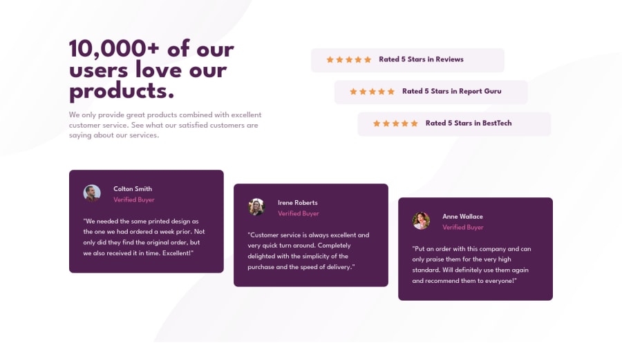
Design comparison
Solution retrospective
What could I have done better in my code?
Community feedback
- @VCaramesPosted almost 2 years ago
Hey there! 👋 Here are some suggestions to help improve your code:
- Along with the blank
alt tag, you also want to include thearia-hidden=“true”to your “stars” to fully remove them from assistive technology.
More Info:📚
https://www.w3schools.com/html/html_images_picture.asp
- The profile images
alt tagsneed to be improved. It should state the following; “Headshot of -person’s full name-“
More Info:📚
- For the testimonials, it is best ✅ to to wrap each individual testimonial component in a
figureelement, the individuals information should be wrapped in afigcaptionelement and lastly, the testimonial itself should be wrapped in ablockquoteelement.
Code:
<figure>
   <blockquote></blockquote>
   <figcaption></figcaption>
</figure>
More Info:📚
- Your
CSS Resetis being underutilized 😢. To fully maximize it, you will want to add more to it.
Here are some examples that you can freely use:
- For improved accessibility 📈 for your content, it is best practice to use
emformedia-queries. Using these unit gives users the ability to scale elements up and down, relative to a set value.
If you have any questions or need further clarification, feel free to reach out to me.
Happy Coding! 🎄🎁
Marked as helpful1@hello-sabiraPosted almost 2 years ago@vcarames Omg thank you soo soo much, truly appreciate your detailed response!
1 - Along with the blank
- @Jeen-PreshPosted almost 2 years ago
Hi there 👋. Good job on completing the challenge! I have some feedback for you if you want to improve your code:
• Implement a Mobile First approach 📱 > 🖥 Your review_cards / Testimonial Sections are meant to be stacked and span across on mobile devices
With mobile devices being the predominant way that people view websites/content. It is more crucial than ever to ensure that your website/content looks presentable on all mobile devices. To achieve this, you start building your website/content for smaller screen first and then adjust your content for larger screens.
Marked as helpful1@hello-sabiraPosted almost 2 years ago@Jeen-Presh Hey there, good catch!! I'm aware how it's supposed to look on phone, I made a small update to my desktop card width right before publishing, totally forgot to check for responsive view after that, oops. Thank you for informing! <3 I've updated my code now on Github and it looks okay now I guess. You're right about mobile first approach, do you have any resources for more info on this? I still struggle "thinking" from mobile view and then getting bigger rather than the opposite. Thanks!
0 - @Jeen-PreshPosted almost 2 years ago
@hello-sabira Hi once again. For resources on mobile-first approach you can use the following link
https://developer.mozilla.org/enUS/docs/Web/Progressive_web_apps/Responsive/Mobile_first
I also learnt by watching experienced Web Devs do some front-end projects where they applied the concepts of mobile-first then move on to Desktop screens.
https://www.youtube.com/watch?v=K27WULzr2P8
That’s a link to the same project you did, he went from mobile-first design to Desktop design. Take your time watching it and tell me if you learnt anything new. You can also practise the new concepts you will learn from the video on other projects. Feel free to get back if this was helpful. Have fun.
Marked as helpful0
Please log in to post a comment
Log in with GitHubJoin our Discord community
Join thousands of Frontend Mentor community members taking the challenges, sharing resources, helping each other, and chatting about all things front-end!
Join our Discord
