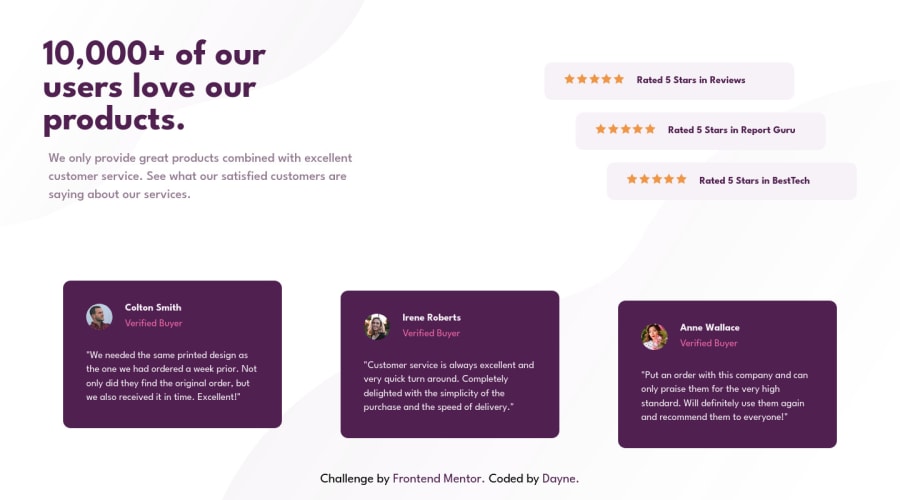
Design comparison
Solution retrospective
So I did a few things differently this time as per all the feedback I got over the course of doing my previous projects. I'm not satisfied with how the finished project looks, and I've yet to complete the mobile version. Any feedback on how to achieve a look more similar to the target appearance, in relation to the code I've written would be appreciated.
Community feedback
- @VCaramesPosted almost 2 years ago
Hey there! 👋 Here are some suggestions to help improve your code:
Regarding your question,
Implement a Mobile First approach 📱 > 🖥
With mobile devices being the predominant way that people view websites/content. It is more crucial than ever to ensure that your website/content looks presentable on all mobile devices. To achieve this, you start building your website/content for smaller screen first and then adjust your content for larger screens.
- The “10,000+ of our users love our products” should be wrapped in a heading element. in this case, it would be the
h1heading.
- Along with the blank
Alt Tag, you also want to include thearia-hidden=“true”to your “stars” to fully remove them from assistive technology.
More Info:📚
https://www.w3schools.com/html/html_images_picture.asp
- The profile images
alt tagsneed to be improved. It should state the following; “Headshot of -person’s full name-“
More Info:📚
- For the testimonials, it is best to to wrap each individual testimonial component in a
figureelement, the individuals information should be wrapped in afigcaptionelement and lastly, the testimonial itself should be wrapped in ablockquoteelement.
Code:
<figure>
   <figcaption></figcaption>
   <blockquote></blockquote>
</figure>
More Info:📚
- Your CSS Reset is extremely bare and being underutilized. To fully maximize your CSS reset, you want to add more to it.
Here are few CSS Resets that you can look at and use to create your own or just copy and paste one that is already prebuilt.
https://www.joshwcomeau.com/css/custom-css-reset/
https://meyerweb.com/eric/tools/css/reset/
http://html5doctor.com/html-5-reset-stylesheet/
If you have any questions or need further clarification, feel free to reach out to me.
Happy Coding!🎄🎁
Marked as helpful0@Dayne2xPosted almost 2 years ago@vcarames Hey, As always thanks for your feedback. Any more pointers on what should I do have the testimony cards look more like they're supposed to. The preview I get while viewing it on my PC looks good, but when I upload it, it looks worse. Thanks in advance.
1@VCaramesPosted almost 2 years ago@Dayne2x
Glad I could help!☃️
You can take a look at my code and see how I did it.
https://www.frontendmentor.io/solutions/social-proof-section-css-flex-and-animation-YPeDVv5Qs6
Keep it up!
Marked as helpful0 - The “10,000+ of our users love our products” should be wrapped in a heading element. in this case, it would be the
Please log in to post a comment
Log in with GitHubJoin our Discord community
Join thousands of Frontend Mentor community members taking the challenges, sharing resources, helping each other, and chatting about all things front-end!
Join our Discord
