Design comparison
Community feedback
- @rsrclabPosted about 3 years ago
Hi, @leslief10 ~
Congratulate on your solution to the challenge on FM platform. I have studied your work carefully and learned a lot from it.
Here are some of the tips I like to provide.
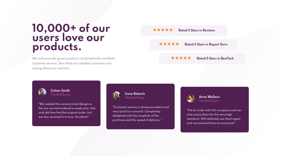
- Background image doesn't fill the screen.
https://www.frontendmentor.io/solutions/social-proof-solution-bHjGitZ_n
Here is my solution to this challenge, and if it can help you even a bit, it would be happy to me.
Cheers ~
Marked as helpful0P@leslief10Posted about 3 years ago@tymren608 Hi! Thanks for the feedback! Are you referring to where the footer starts? If that's the case, it's on purpose since I wanted the footer/attribution to not be a continuation of the background image. I will definitely keep it in mind for future challenges.
Thanks again!
0
Please log in to post a comment
Log in with GitHubJoin our Discord community
Join thousands of Frontend Mentor community members taking the challenges, sharing resources, helping each other, and chatting about all things front-end!
Join our Discord
