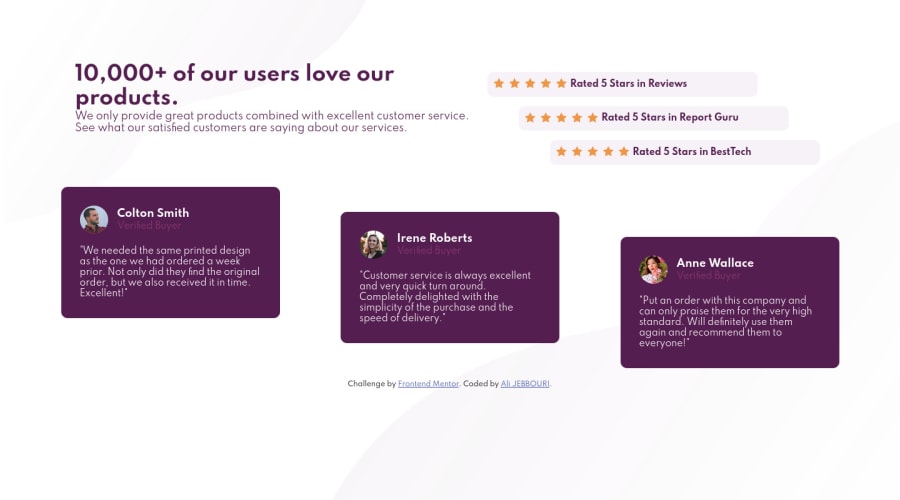


Design comparison

Solution retrospective
welcome with your feedback
Community feedback
- @Yup03Posted almost 2 years ago
Hi @Alijebbouri, great job But i think to improve responsiveness you could actually add a breakpoint at 900 px so your heading and your paragraph will have more space and that will avoid them to break for example you can do:
@media(max-width: 900px){ .header{ margin-left: 50px; }
You could also add a margin bottom to your h1 to put it a little bit away from the paragraphMarked as helpful0 - @HassiaiPosted almost 2 years ago
@Alijebbouri , well done for completing this challenge, you did a good job. Checkout, these: Give .text a width value of 40% and .rating a with value of 50% . Add a gap value or just-content: space-between to the header. Give the main gap:20px; instead of justify-content: space-around;
increase the font-weight of the comment: cards >p{font-weight:700} . cards >p refers to the direct child of .cards which is p.
Use rem or em as unit for the padding, margin, width and preferably rem for the font-size for more on this watch this https://youtu.be/N5wpD9Ov_To Hope am helpful HAPPY CODING
0 - @catherineisonlinePosted almost 2 years ago
I would create a bit more gap between the star icons and the text. Also, you can change div to the footer in the div with class attribution to remove this report issue
0


Please log in to post a comment
Log in with GitHub
Join our Discord community
Join thousands of Frontend Mentor community members taking the challenges, sharing resources, helping each other, and chatting about all things front-end!
Join our Discord