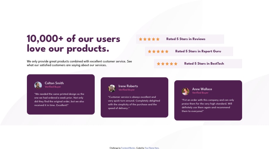
Design comparison
Solution retrospective
Is my code understandable?
Did I use the semantic HTML tags correctly, should I add more or less?
In what areas of my code can I improve on?
All feedback is greatly appreciate. It helps me to improve as a frontend developer. Thanks!
Community feedback
- @jakubjirousPosted about 2 years ago
Hi Karen,
First of all, the HTML code provided is well-structured and organized. The use of semantic tags such as
main,section,h1,h2,p, andfooteris appropriate and helps in understanding the layout of the page.The CSS code is also well-organized and follows best practices by using
* { margin: 0; padding: 0; }to reset the default margins and padding of all elements. It's good to see that the author has used descriptive class and ID names to style the different elements of the page.However, there are a few areas where the CSS code could be improved. Firstly, the
background-imageproperty is set twice in thebodyselector. It's unnecessary to set the background image twice, and the second declaration will overwrite the first one.Secondly, the grid-template property of the
mainselector is not complete. It's recommended to specify the number of rows and columns that the grid should have. For example,grid-template-columns: 1fr 1fr;would create a grid with two equal columns.Overall, the provided HTML and CSS code is of good quality and follows best practices. With a few minor improvements, it could be even better.
Keep up the great work and happy coding!
Marked as helpful0
Please log in to post a comment
Log in with GitHubJoin our Discord community
Join thousands of Frontend Mentor community members taking the challenges, sharing resources, helping each other, and chatting about all things front-end!
Join our Discord
