@pikapikamart
Posted
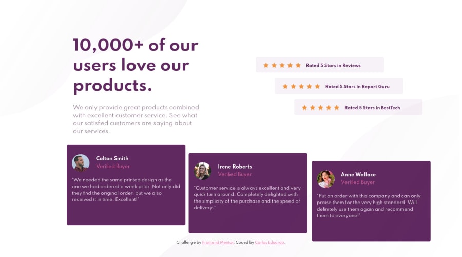
Hey, great work on this one. Layout looks fine in desktop and the mobile state is good as well. Though on responsiveness, you may need to sort that out. Always inspect your layout in dev tools before finalizing all things and submitting, change screen sizes, make sure things are looking good and fitting well.
Suresh already gave great feedbacks, just going to add some and explain things:
- This text
10,000+ of our users love our products.
could have been theh1
element. Always have at least 1h1
per webpage. Now, to get it good looking, when you useh1
, you don't need to usebr
on it to make other words wrapped in another row. Instead, you could usemax-width
so that it will be limited and the words will be wrapped in another row, the value of that, well, it is up to you. - On the testimonial section, the
img
of each person could have used their name as thealt
value, likealt="Colton Smith"
. - The name of the person per testimonial could have been wrapped inside a heading tag, like
h2
.
Aside from those, great job. But keep in mind about the responsiveness part, that is really important.
Marked as helpful