Submitted over 2 years ago
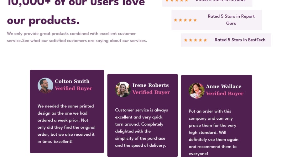
Social proof and testimonials using flexbox and media queries.
@BismeetSingh
Design comparison
SolutionDesign
Solution retrospective
Responsiveness took quite a long time to come up with on this one. I am not sure why I need to set main { height: 100%; } inside the media query when I already 100vh, which should occupy the full viewport. Without adding that, the ui on mobile goes for a toss.
Community feedback
Please log in to post a comment
Log in with GitHubJoin our Discord community
Join thousands of Frontend Mentor community members taking the challenges, sharing resources, helping each other, and chatting about all things front-end!
Join our Discord
