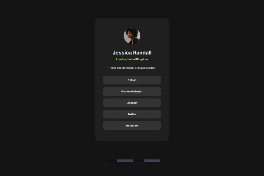
Design comparison
Solution retrospective
Can anyone suggest how to be good at mobile responsiveness please?
Community feedback
- @StroudyPosted about 2 months ago
@bajwacodes, I’d like to provide some feedback. In past challenges, I noticed you haven't engaged or responded when solutions were submitted. Networking and actively engaging with the community are essential, and I highly encourage you to embrace these practices. They can greatly enhance collaboration and growth.
Marked as helpful0 - @MikDra1Posted about 2 months ago
Well done, here are some things to review 😊:
-
Overusing div tags: Try using more semantic HTML elements like
<section>,<header>, and<article>. It’ll help with both accessibility and SEO. -
Poor use of Flexbox and Grid: Be careful not to mix Flexbox and Grid unnecessarily. Each has its strengths—use the right one based on the layout needs.
-
Not testing across browsers: Don’t forget to check how your site looks in different browsers like Firefox and Safari. Cross-browser testing is super important.
-
Ignoring accessibility: Focus on features like keyboard navigation, contrast ratios, and ARIA labels. They make your site usable for more people.
-
Using fixed heights for elements: Setting fixed heights can cause overflow issues. Use
min-heightor allow content to expand naturally to avoid problems. -
Not using responsive images: Be sure to use
srcsetor the<picture>element to optimize images for different devices. This improves performance, especially on mobile.
Hope you found this comment helpful 💗💗💗
Good job and keep going 😁😊😉
Marked as helpful0 -
Please log in to post a comment
Log in with GitHubJoin our Discord community
Join thousands of Frontend Mentor community members taking the challenges, sharing resources, helping each other, and chatting about all things front-end!
Join our Discord
