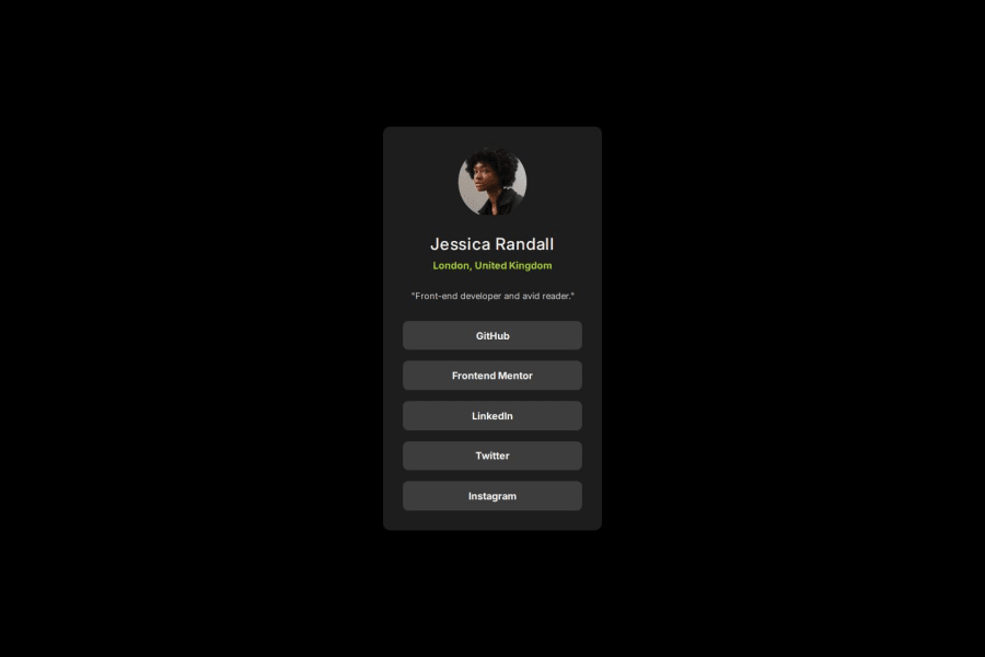


Design comparison

Solution retrospective
I think I got this done in very little time. Just shows that I'm getting good at this. Can't wait to learn more and do more projects.
What challenges did you encounter, and how did you overcome them?Didn't really face a lot of challenges on this one. One thing though, was figuring out how to center the card in the middle on the screen for both mobile and desktop views. I had to read documentation to get this done.
What specific areas of your project would you like help with?None so far
Community feedback
- @TonyzCataldoPosted about 1 month ago
i am begginer too, but what i can say is: be careful with background colors... your body background color is wrong... in the challenge doc has a file that contains the instructions about colors and font-family... another note: try to change the width... the goal is make more similar as you can to original design. good learning :) ;)
0

Please log in to post a comment
Log in with GitHubJoin our Discord community
Join thousands of Frontend Mentor community members taking the challenges, sharing resources, helping each other, and chatting about all things front-end!
Join our Discord