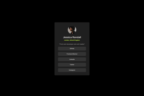
Submitted about 1 year agoA solution to the Social links profile challenge
Social profile solution
@Alingggg

Solution retrospective
What are you most proud of, and what would you do differently next time?
I added a reset css, tried to maximize using relative units, followed the BEM class naming convention, and hopefully I used the best html tags for each content. All of those were tips from my previous submissions.
What challenges did you encounter, and how did you overcome them?I took a long time properly formatting the buttons.
What specific areas of your project would you like help with?Any improvements about the things I mentioned above ^^^ ? (relative units, semantics, etc.)
Code
Loading...
Please log in to post a comment
Log in with GitHubCommunity feedback
No feedback yet. Be the first to give feedback on Alingggg's solution.
Join our Discord community
Join thousands of Frontend Mentor community members taking the challenges, sharing resources, helping each other, and chatting about all things front-end!
Join our Discord