Submitted 6 months ago
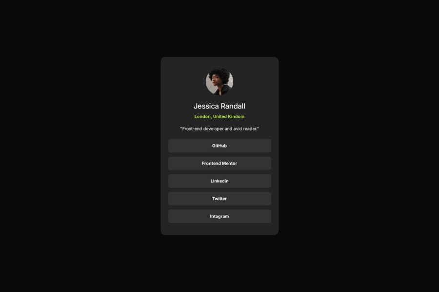
Social Profile Main
#tailwind-css
@Pablo-Zallio-Dev
Design comparison
SolutionDesign
Solution retrospective
What are you most proud of, and what would you do differently next time?
In this project, as I did not have the Figma design file, I had to take the measurements in magin, paddings, etc. by myself. And I think the result was very satisfactory.
Community feedback
Please log in to post a comment
Log in with GitHubJoin our Discord community
Join thousands of Frontend Mentor community members taking the challenges, sharing resources, helping each other, and chatting about all things front-end!
Join our Discord
