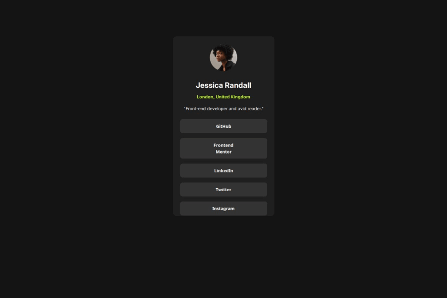
Design comparison
SolutionDesign
Solution retrospective
What are you most proud of, and what would you do differently next time?
Making this challenge closer enough to the original. I don't want to use negative margins anymore.
What challenges did you encounter, and how did you overcome them?Align the elements and I used negative margins.
What specific areas of your project would you like help with?How I can align better my elements without using negative margins?
Community feedback
- @SvitlanaSuslenkovaPosted about 2 months ago
body { display: flex; flex-direction: column; justify-content: center; align-items: center; min-height: 100vh; } Try this to align(top-bottom) and justify(left-right) your project to the center. It applies to the parent component(body), don't forget about !!min-height!!. You can use grid instead of flex too.
Marked as helpful0
Please log in to post a comment
Log in with GitHubJoin our Discord community
Join thousands of Frontend Mentor community members taking the challenges, sharing resources, helping each other, and chatting about all things front-end!
Join our Discord
