Social profile links Solution using HTML and CSS


Design comparison

Solution retrospective
I'm proud that I was able to complete this project in just one day, using semantic HTML and good CSS styling, ensuring that it was as visually similar to the design as possible. However, I'm using the free version here, I couldn't download the Figma file because of the Pro subscription requirement. Instead, I managed to manually measure the design image, where available in the free version, in pixels and applied those values to my code. I'm happy with how closely it matches the design.
What challenges did you encounter, and how did you overcome them?I didn't face any major difficulties during that development, but I'm always learning and finding ways to improve my skills.
What specific areas of your project would you like help with?I don't have any particular areas where I need help right now, but I'd welcome any tips on improving my CSS and HTML skills. I'm especially interested in learning better ways to organize styles and improve accessibility in my projects.
Community feedback
- P@RahexxPosted 5 months ago
Great work with this challenge to make the website look so close to the design without Figma! You can definitely be proud of yourself.
Okay, so here is a little feedback from me:
-
Good job with using BEM methodology.
I hope that advice was helpful for you. -
Your alt attributes look great.
It's great that you didn't describe the person too precisely because, when you have thousands of users, it’s not practical to create an accurate alt description for every profile picture. -
Great use of
aria-label.
It’s also very important for accessibility. -
Unnecessary white lines in the HTML file.
Some white lines in the HTML file are unnecessary. Whitespace between sections is a good idea to indicate where each section ends.
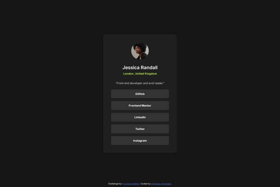
<div class="profile__header"> <img src="assets/images/avatar-jessica.jpeg" alt="Portrait of Jessica Randall" class="profile__avatar"> <h1 class="profile__name">Jessica Randall</h1> <p class="profile__place">London, United Kingdom</p> <p class="profile__description">"Front-end developer and avid reader."</p> </div>-
Great use of custom properties.
Nice job organizing them into sections. I would suggest adding another section for spacing, like margin and padding. Also, consider including font-weight properties in your font-related section for better organization. -
The rest of the CSS looks good, but I recommend using a mobile-first approach.
This method makes it easier to scale your styles for larger screens and is particularly useful for bigger projects. It’s also the recommended approach, especially as mobile devices become increasingly important in web design.Here’s a helpful article about mobile-first design:
CSS-Tricks - Mobile First. -
Why mobile-first?
Mobile-first is a more practical and scalable solution. Phones are becoming the primary devices we use, so it makes sense to design for them first. Starting small and scaling up for larger devices often simplifies the design process.
Keep up the great work, and happy coding!
Marked as helpful1@vladyslav-shulhachPosted 5 months ago@Rahexx Great feedback! Thank you so much!
1 -


Please log in to post a comment
Log in with GitHubJoin our Discord community
Join thousands of Frontend Mentor community members taking the challenges, sharing resources, helping each other, and chatting about all things front-end!
Join our Discord