Not Found
Not Found
Not Found
Not Found
Not Found
Not Found
Not Found
Not Found
Not Found
Not Found
Not Found
Not Found
Not Found
Not Found
Not Found
Not Found
Not Found
Not Found
Not Found
Not Found

Submitted

Social Profile Links HTML CSS

RKennedyy 100

@RKennedyy

Desktop design screenshot for the Social links profile coding challenge

This is a solution for...

  • HTML
  • CSS
1newbie
View challenge

Design comparison


SolutionDesign

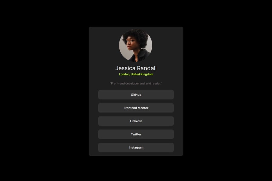
Solution retrospective


What are you most proud of, and what would you do differently next time?

The thought process I followed to use buttons instead of multiple divs which saved me having to write css and then copy and paste it for each div.

What challenges did you encounter, and how did you overcome them?

I still struggle with responsiveness and its definitely something I need to review to get a better understanding of.

What specific areas of your project would you like help with?

Responsiveness - if anyone has any pointers or can share some advice on what I should be thinking/doing when trying to make the webpage responsive

Community feedback

@DylandeBruijn

Posted

Hi @RKennedyy,

I hope you had fun coding this project, it looks great!

A bit of friendly constructive feedback:

  • If you would like to center the card you could try this on your body tag:
body {
    background-color: black;
    min-height: 100vh;
    display: flex;
    align-items: center;
    justify-content: center;
    margin: 0;
}

This way you don't have to center it using margin: auto with margin-top. I put margin: 0 on the body as well in your code so there aren't any scrollbars showing up. I normally put this in a CSS reset.

  • You could try wrapping all your links in a unordered list ul to give it more semantic meaning, then you can use a layout tool like flex to style them how you want. Using flex instead of margins to layout your elements will make them more predictable and scalable. Also try using a tags for your links instead of a button tag. Generally you would use a tags if the link wil navigate the user to a different website or page and a button if you something to happen on the page. You can style both to look like a button!

  • Try to use more descriptive and meaningful classes like .card and .card-title for example to help yourself style things more easily and other developers to read your code.

  • To make an image a circle you can use border-radius: 50% for your interest.

I notice you are experimenting a lot with different properties and values to see what they do, which is a good thing. However try to understand what each thing does exactly to the element you apply it to and the elements around it. It's important to master the fundamentals.

Some documentation you might find intereseting:

I hope you find my feedback helpful and if you have any other questions I would be glad to answer them.

Marked as helpful

0

Please log in to post a comment

Log in with GitHub
Discord logo

Join our Discord community

Join thousands of Frontend Mentor community members taking the challenges, sharing resources, helping each other, and chatting about all things front-end!

Join our Discord