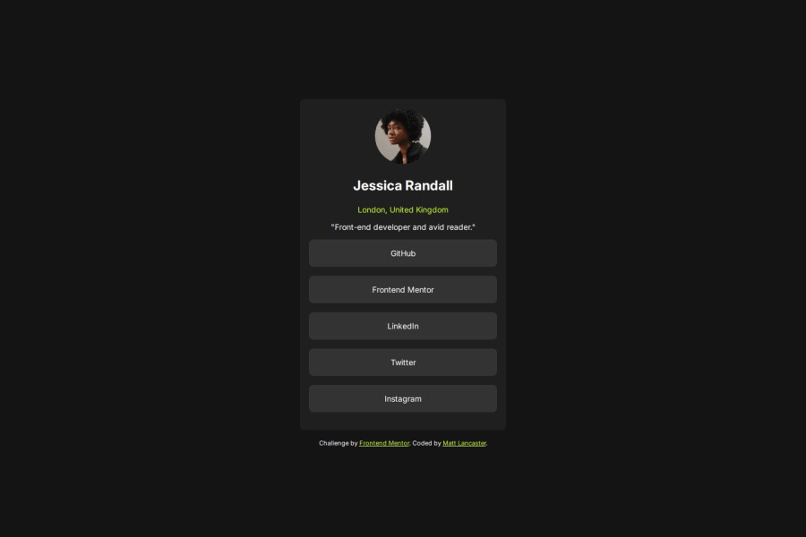
Design comparison
Solution retrospective
I cleaned up some of the ways I was displaying text on the screen and broke my HTML down into a more semantic style.
What challenges did you encounter, and how did you overcome them?Setting up a section and all divs within it receiving the styles. I needed to look this up and found a solution pretty quickly via Google.
Community feedback
- @Grimm-NPosted about 1 month ago
I really appreciate the work you’re doing! 🎉 Your coding skills are impressive, and I can see the effort you put into your projects. To make your code even better, here are a few suggestions:
Improve Mobile Responsiveness 📱: I recommend enhancing the code to ensure the design is optimized for mobile devices. Because let's face it, no one wants to zoom in to read your amazing content! 😅
Use Consistent Units 📏: Consider using units like
rem,em,vh,vw, and%for layout and sizing throughout your code. These units are like the Swiss Army knife of responsive design—versatile and handy! 🛠️ I’ve noticed you're using them partially; expanding their use globally can make a big difference.Aim for Template-Like Code 📑: Try to structure your code to resemble established templates as closely as possible. This approach not only helps us learn but also enables us to tackle challenges like pros—just think of it as leveling up your coding skills! 🎮
Get Familiar with BEM 🏷️: Start getting into the habit of writing classes using the BEM (Block Element Modifier) methodology. It’s like giving your code a neat and tidy haircut—so much easier to manage and understand! 💇♂️
Keep up the great work! I’m excited to see how your projects evolve! 🚀
0 - @nottundeednutPosted about 1 month ago
The font-weight of the links is not applied.
0
Please log in to post a comment
Log in with GitHubJoin our Discord community
Join thousands of Frontend Mentor community members taking the challenges, sharing resources, helping each other, and chatting about all things front-end!
Join our Discord
