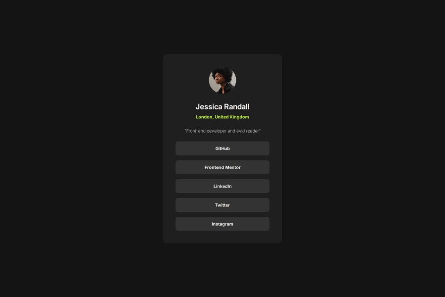
Design comparison
Please log in to post a comment
Log in with GitHubCommunity feedback
- @AdrianoEscarabote
Hi Mckaay, how are you doing? I really loved the outcome of your project, but I have a few suggestions that I think might be helpful:
Since this project is only based on a single page component, there is no need for a h1 tag. It's always a good idea to prevent accessibility errors, so I believe it would be beneficial for you to add a "h1" in this component. Don't worry if you forget about "h1," though; it's a good practice for when you are developing larger sites.
<h1>Welcome to Social links profile</h1>The rest is excellent.
I hope you find it useful. 👍
Marked as helpful - @firdaus3
Wow! Great job on matching the design so closely. I really liked your implementation. I tried doing the same but had some trouble getting the sizes exactly right
Join our Discord community
Join thousands of Frontend Mentor community members taking the challenges, sharing resources, helping each other, and chatting about all things front-end!
Join our Discord
