Not Found
Not Found
Not Found
Not Found
Not Found
Not Found
Not Found
Not Found
Not Found
Not Found
Not Found
Not Found
Not Found
Not Found
Not Found
Not Found
Not Found
Not Found
Not Found
Not Found

Submitted

Social Profile Link

@samuelbm12

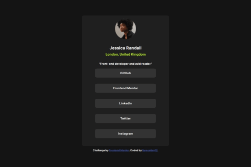
Desktop design screenshot for the Social links profile coding challenge

This is a solution for...

  • HTML
  • CSS
1newbie
View challenge

Design comparison


SolutionDesign

Solution retrospective


What are you most proud of, and what would you do differently next time?

I am Proud of the fact i did the project without any help and next time i would add a bit of JavaScript to it

What challenges did you encounter, and how did you overcome them?

I really did not have any encounter

What specific areas of your project would you like help with?

Just how to use Grid, I know it is not related but i would like to know on my grid

Community feedback

@Hiraeight

Posted

Good Job! It is nice to see a fellow coder is making progress. I would like to suggest some small ways to make your solutions to level up.

  • Media Queries: Introduce media queries to adjust styles based on the screen width, ensuring the layout is optimized for small, medium, and large devices.
  • Text and Font Size Scaling: It is better to use responsive text sizing with rem or viewport-based units like vw or vh so that fonts adjust with screen size. A friend named Fraser Jubb suggested to me this video and it helped me a lot. He did an amazing job applying these practices.
  • Using a <main> tag inside the <body> of your HTML is a best practice because it clearly identifies the main content of your page. This helps with accessibility and improves how search engines understand your content. - Steven Stroud

Amazin job! Keep learning and keep improving!

0
Sylwia 60

@LesSyl

Posted

If you want to know more about grid, you can read here: https://www.frontendmentor.io/learning-paths/building-responsive-layouts--z1qCXVqkD/steps/66cd992d3c19191dc3c1c3c9/article/read

0
Sylwia 60

@LesSyl

Posted

Hi, well done. However, I have a couple of suggestions for your solution. See how your solution displays on small devices, it is offset to the left. Maybe a good solution would be to add a margin to the whole ‘container’ section. Work on this. The whole design looks pretty good. Good luck!

0

Please log in to post a comment

Log in with GitHub
Discord logo

Join our Discord community

Join thousands of Frontend Mentor community members taking the challenges, sharing resources, helping each other, and chatting about all things front-end!

Join our Discord