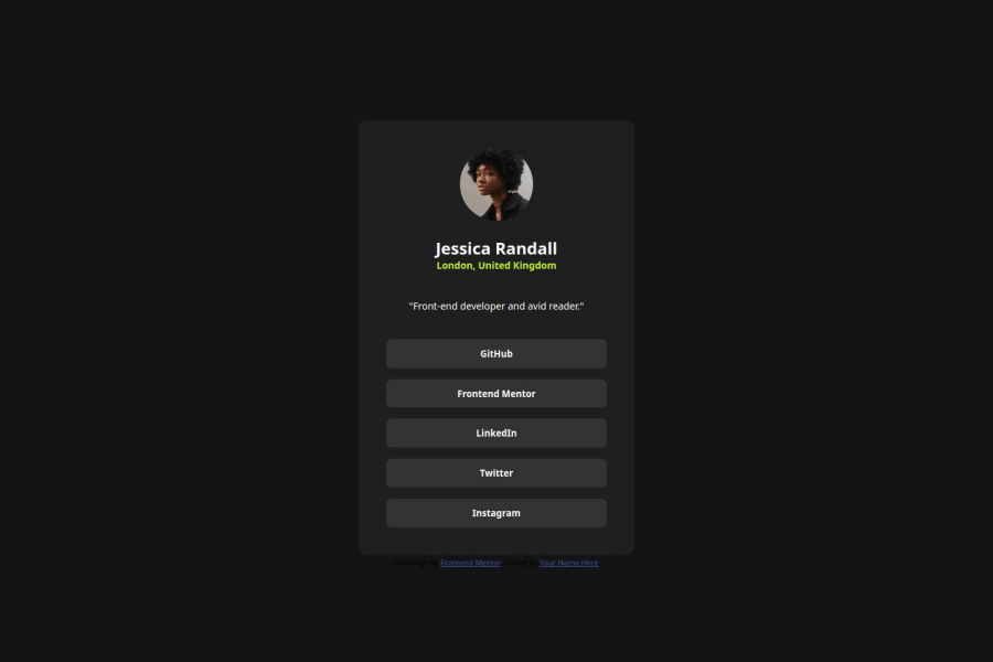
Design comparison
SolutionDesign
Solution retrospective
What are you most proud of, and what would you do differently next time?
Most proud of: Understand the structure from the get-go and an increased speed of doing this challenge, compared to the previous ones.
What would I do differently: Use the flexbox properties more efficiently, rather than relying on the old way of styling/setting boundaries.
What specific areas of your project would you like help with?The most conundrum I have is about setting the width/responsiveness and the general card margin. This should be responsive across screen widths, but I don't grasp which is the actual standard/expectation for it to be considered like so.
Community feedback
Please log in to post a comment
Log in with GitHubJoin our Discord community
Join thousands of Frontend Mentor community members taking the challenges, sharing resources, helping each other, and chatting about all things front-end!
Join our Discord
