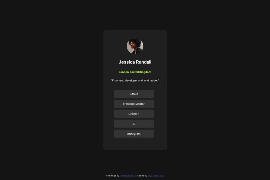
Design comparison
SolutionDesign
Solution retrospective
What are you most proud of, and what would you do differently next time?
The challenges are getting easier and easier for me
I was able to create the entire layout and get it looking nice before I looked at the figma file to apply the styling
What challenges did you encounter, and how did you overcome them?None really
What specific areas of your project would you like help with?For my last two projects I got great feedback and that has helped me
At this point, I feel like I have a firm grasp of the projects, but I am still enjoying building them
I have completely restarted the design of my personal site project with the knowledge I have learned
Please log in to post a comment
Log in with GitHubCommunity feedback
No feedback yet. Be the first to give feedback on Adam Bethlehem's solution.
Join our Discord community
Join thousands of Frontend Mentor community members taking the challenges, sharing resources, helping each other, and chatting about all things front-end!
Join our Discord
