Design comparison
Solution retrospective
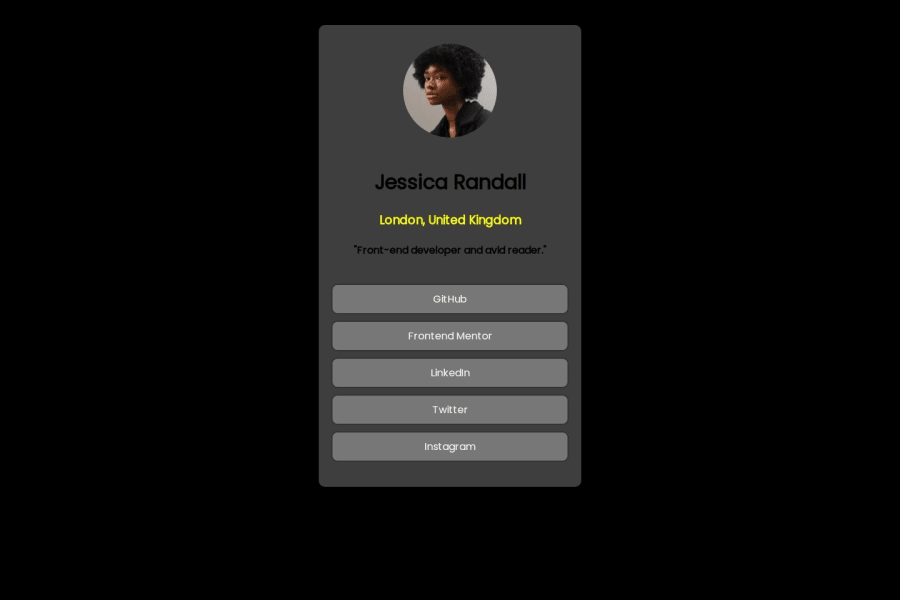
This project is a personal profile webpage for Jessica Randall, showcasing her name, location, profession, and a short bio. The main purpose is to create a simple and visually appealing mobile-responsive webpage that can serve as an introduction or landing page. It includes a profile picture, contact buttons, and information that highlights Jessica as a front-end developer and avid reader. The page is designed with clean styling to ensure a good user experience on mobile devices.
While working on this project, I learned how to structure HTML elements effectively to ensure a clean and organized layout. I also improved my CSS skills, especially in making the page responsive across different device sizes using media queries and flexible grid layouts. Working on this project has given me more insight into the importance of user-centered design, particularly for mobile-first applications. Additionally, I gained more familiarity with linking buttons to external resources such as social media profiles or portfolio pages.
I would appreciate support in improving the overall design, particularly with the use of modern CSS techniques like Flexbox and Grid to make the layout more dynamic and scalable. Additionally, I could use help in optimizing the page for performance, ensuring that the images load efficiently, and incorporating JavaScript to add more interactivity, such as animations or hover effects. Any feedback on best practices for creating more polished, professional-looking web pages would also be helpful.
What challenges did you encounter, and how did you overcome them?The challenges I encountered are in the CSS which include the display, the buttons(the styling) and in the media screen for smartphone users so the design will be well arranged on smartphone users
What specific areas of your project would you like help with?I would like help with the interaction of the website using JavaScript
Community feedback
- @Rahmonbek-0001Posted 5 months ago
Your site is great but you don't get the colors from read.me or you lost the colors but ask the people who worked more on this site how to work on this site where do you get color and where do you get images,svg they will help you. Frontend Mentor Page's Discord Channel "https://discord.com/invite/UAfh3qzhYb"
Marked as helpful1@Marvel123gPosted 5 months ago@Rahmonbek-0001 I lost the colors that was why I improvised
0
Please log in to post a comment
Log in with GitHubJoin our Discord community
Join thousands of Frontend Mentor community members taking the challenges, sharing resources, helping each other, and chatting about all things front-end!
Join our Discord
