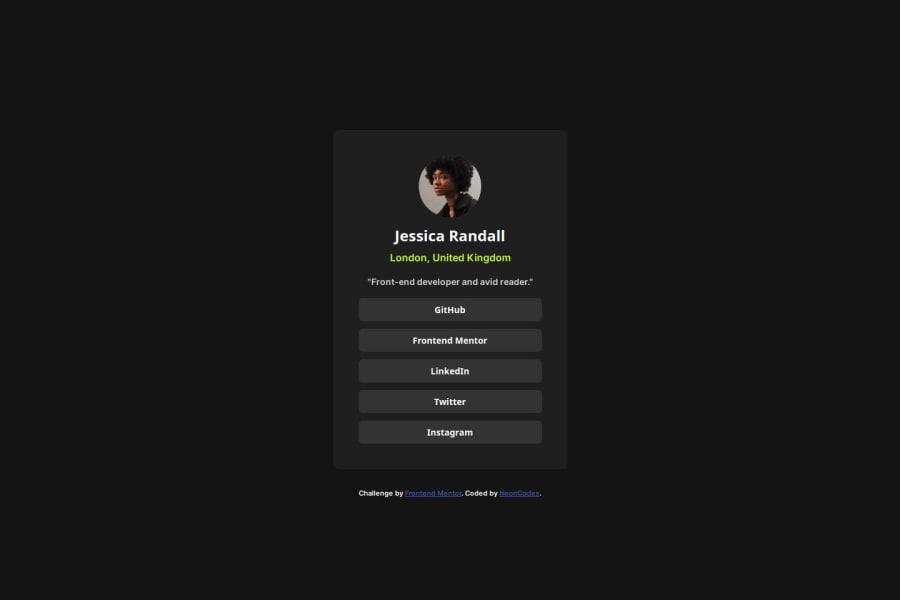
Design comparison
SolutionDesign
Solution retrospective
What are you most proud of, and what would you do differently next time?
It took less time to finish the challenge. I tried to make my code more readable and accessible as well. Maybe I'll try other tools next time.
What challenges did you encounter, and how did you overcome them?Since I didn't have access to the figma file, I had to guess the different sizes: It was a lot of trial and error. I also forgot how to style buttons, so I had to look that up too.
What specific areas of your project would you like help with?Any advice on the previous points: the code readability or things that could have been done more easily.
Community feedback
Please log in to post a comment
Log in with GitHubJoin our Discord community
Join thousands of Frontend Mentor community members taking the challenges, sharing resources, helping each other, and chatting about all things front-end!
Join our Discord
