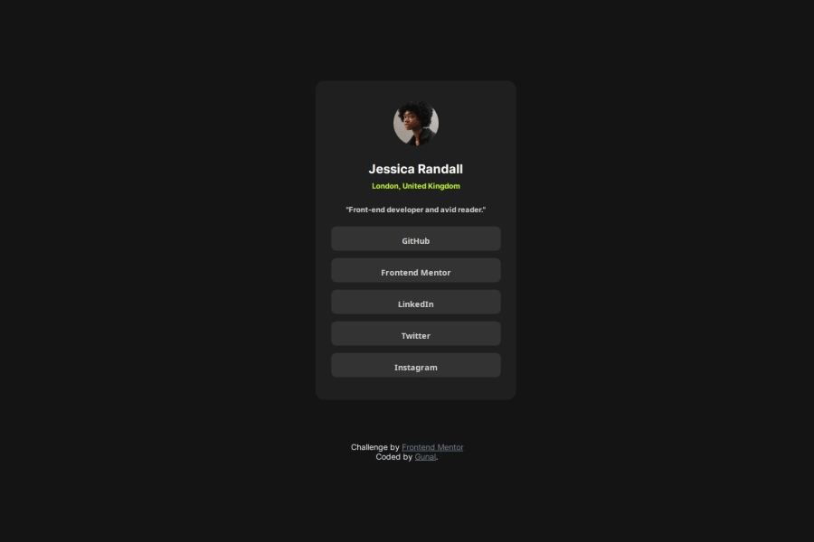
Design comparison
Solution retrospective
I've just completed a front-end coding challenge from @frontendmentor! 🎉
You can see my solution here: https://www.frontendmentor.io/solutions/social-media-profile-t65PHk6lcU
Any suggestions on how I can improve are welcome!
What challenges did you encounter, and how did you overcome them?One challenge I encountered was ensuring that the layout and styling were responsive across various devices and screen sizes. To overcome this challenge, I utilized media queries to adjust the styles based on the viewport width. By testing the layout on different devices and using tools like browser developer tools to simulate various screen sizes, I was able to identify areas that needed adjustments and fine-tune the CSS accordingly.
Another challenge was selecting an appropriate color scheme that not only looked visually appealing but also provided good contrast and readability. To address this, I experimented with different color combinations and tested them in the context of the preview card layout. I also considered accessibility guidelines to ensure that text and interactive elements had sufficient contrast for easy readability.
Lastly, integrating external fonts from Google Fonts posed a minor challenge in terms of correctly importing and applying the font styles. However, by following the documentation provided by Google Fonts and ensuring proper syntax in the CSS import statement, I was able to successfully integrate the desired font into the project.
Overall, by leveraging testing, experimentation, and attention to detail, I was able to overcome these challenges and create a visually appealing and functional front-end design for the eMentor challenge.
What specific areas of your project would you like help with?If I were seeking help with this project, I might ask for feedback on specific aspects such as:
-
Visual Design: Are the colors, typography, and overall layout aesthetically pleasing and appropriate for the content?
-
Responsiveness: Does the layout adapt well to different screen sizes and devices? Are there any specific breakpoints or adjustments that could improve the responsiveness further?
-
Code Optimization: Is the CSS code well-organized, maintainable, and efficient? Are there any redundant styles or opportunities for optimization?
-
Accessibility: Are the colors and contrast levels suitable for users with visual impairments? Are interactive elements accessible via keyboard navigation?
-
Browser Compatibility: Have I tested the layout across different browsers to ensure consistent rendering and functionality?
-
User Experience: Is the user experience intuitive and seamless? Are there any improvements that could enhance usability or interactivity?
-
Performance: Are there any performance bottlenecks, such as large image files or excessive CSS/JavaScript? Are there optimizations that could improve page load times?
Receiving feedback on these areas can help me refine and improve the project, ensuring it meets both functional and aesthetic requirements.
Community feedback
- @danielmrz-devPosted 7 months ago
Hello @Gunal-k!
Your solution looks great!
I have a suggestion for improvement:
📌 Think about using
<main>to wrap your main content instead of<div>.Imagine
<div>and<span>in HTML as basic containers. They're good for holding stuff, but they don't tell us much about what's inside or its purpose on the webpage.This change might not have impact on how your page looks, but it'll make your HTML code clearer and help with SEO and accessibility.
Hope that's helpful!
Keep up the great work!
0
Please log in to post a comment
Log in with GitHubJoin our Discord community
Join thousands of Frontend Mentor community members taking the challenges, sharing resources, helping each other, and chatting about all things front-end!
Join our Discord
