

Design comparison

Solution retrospective
Since this project is fairly similar to the previous two, I decided to focus on speed rather than accuracy to practice making quick decisions and avoid playing around with small details. It ended up being about 35 minutes which is okay but I feel like this could have been done quicker.
I followed the following process:
- Initialize project
- Finish HTML
- Define constants and typography
- Finish CSS
- Push to repository
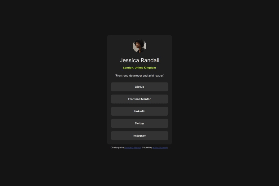
Some minor padding/margin issues with the whole card and the button-links that I think made for a slightly weirder solution, hopefully I can see how others did it. Also it was a little difficult to tell what the font weights were supposed to be from the image.
What specific areas of your project would you like help with?Any advice pointing out something I'm not realizing that I could have done differently or better. Particularly with my CSS file, even something like code clarity.
Community feedback
- @LincolnBollschweilerPosted 2 months ago
Arthur, great work! The only suggestions I might have are -- give the social links actual links to the home pages of those socials -- give all page links target="_blank" and probably rel="noopenner noreferrer"
Happy coding! --Lincoln
0

Please log in to post a comment
Log in with GitHubJoin our Discord community
Join thousands of Frontend Mentor community members taking the challenges, sharing resources, helping each other, and chatting about all things front-end!
Join our Discord