Design comparison
SolutionDesign
Solution retrospective
What are you most proud of, and what would you do differently next time?
/
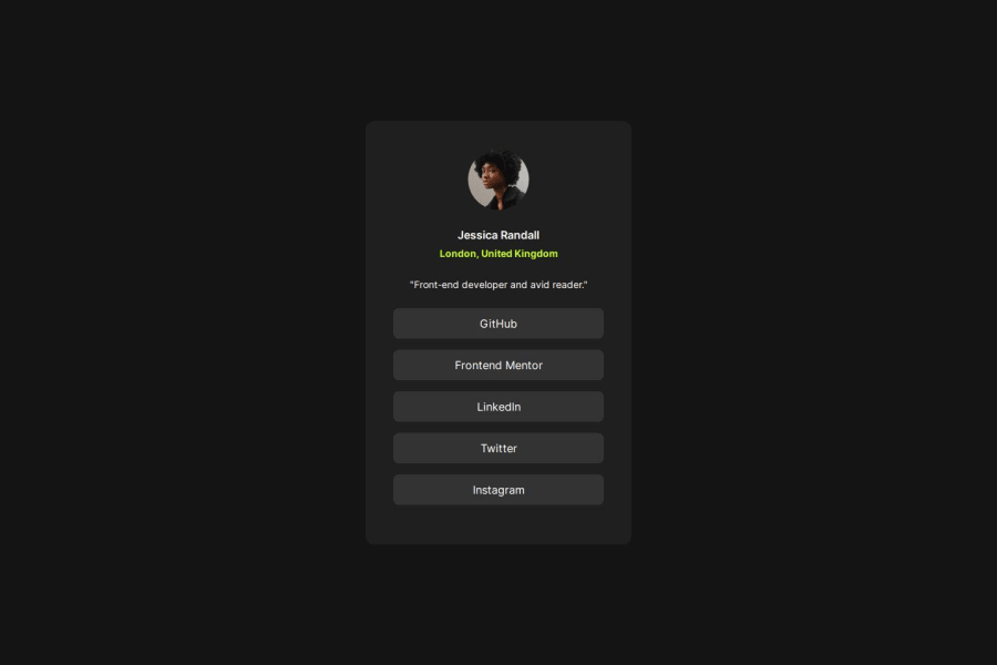
What challenges did you encounter, and how did you overcome them?At first i did not know how to get all the hrefs the same size. turns out i needed align self to do so.
What specific areas of your project would you like help with?Im just unsure if this is the way to go in terms of sizing the main object, in this case the main. i dont think the best solution is to give it a set width. but dont really see a better way to do this.
Community feedback
- @josifermaodevPosted 4 months ago
In my opinion, your code is good.
The only thing is that the
h1tag is disproportionately large, it should be bigger.Congratulations on the project, it's perfect!
Marked as helpful0
Please log in to post a comment
Log in with GitHubJoin our Discord community
Join thousands of Frontend Mentor community members taking the challenges, sharing resources, helping each other, and chatting about all things front-end!
Join our Discord
