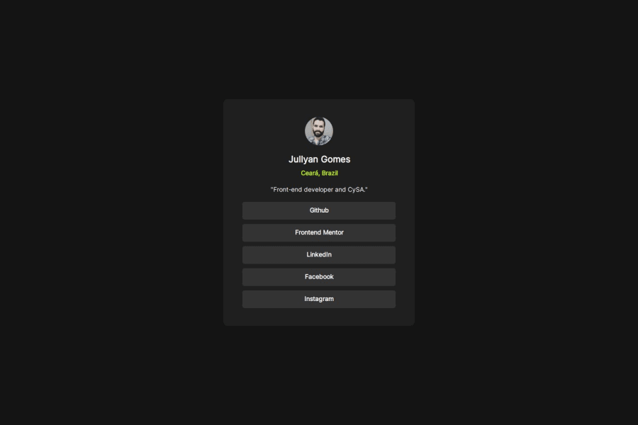
Design comparison
Solution retrospective
It was a nice way to come back to my studies.
What challenges did you encounter, and how did you overcome them?The hardest part for me was organizing the tags in containers and using the a tags. I tried using the button tag first, but it didn't work out the way I wanted to.
Community feedback
- @jpcardozxPosted 9 months ago
Hey, great job on your project! It's awesome to see you getting back into your studies and tackling these coding challenges. The layout looks neat, and your use of a tags for links instead of button tags shows you've got a good handle on keeping things accessible and well-structured. It’s those little details that make a big difference!
I really liked reading about the challenges you faced, especially with organizing tags and figuring out the right elements to use. It's always tricky at first, but you've learned a lot by figuring out what works best. Keep at it, and don't be afraid to experiment—each time you push through a challenge, you're getting stronger as a developer. Great work, and keep it up!
Marked as helpful1
Please log in to post a comment
Log in with GitHubJoin our Discord community
Join thousands of Frontend Mentor community members taking the challenges, sharing resources, helping each other, and chatting about all things front-end!
Join our Discord
