

Design comparison
SolutionDesign

Community feedback
- P@rmmcfarlinPosted 2 months ago
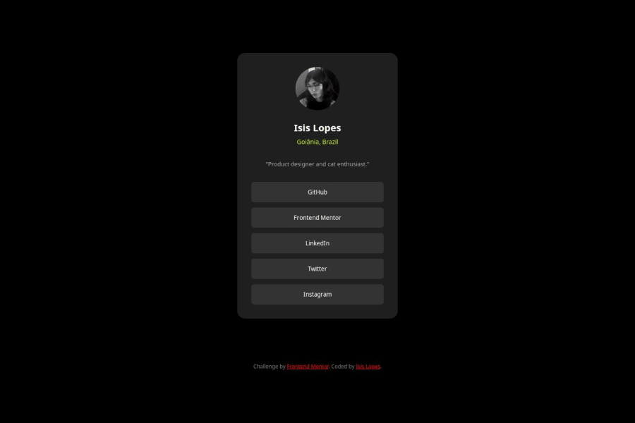
This solution looks pretty close, I think the attribution at the bottom is pushing the design up and off center, maybe try an absolute position for the attribution element to keep it stuck on the bottom of the viewport? Only other thing is the background color of the body is darker, but you can fix this looking at the exact color in the style guide. Nice job overall!
0

Please log in to post a comment
Log in with GitHubJoin our Discord community
Join thousands of Frontend Mentor community members taking the challenges, sharing resources, helping each other, and chatting about all things front-end!
Join our Discord