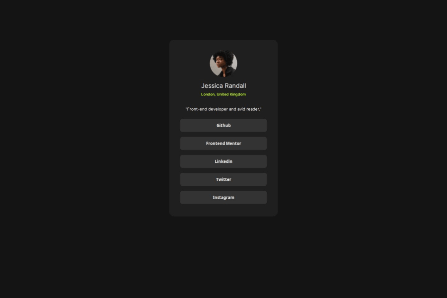
Social media links page using HTML and CSS
Design comparison
Solution retrospective
I am proud of the thing that I made this on my own and took no help from youtube or google, I faced difficulties, but I did it. I am getting good at this, but I have more to learn.
What challenges did you encounter, and how did you overcome them?The most problem I faced in image, The browser was not loading my image and there was a error like "not allowed to load local resources" so I copied the link of other people who have already done this project. If you know how to solve this error. please let me know.
What specific areas of your project would you like help with?you can see that the .container is not centered properly, I tried margin auto but it didn't leave any space on top but was centered from all the other directions, I would really like to know how to center it properly.
Community feedback
Please log in to post a comment
Log in with GitHubJoin our Discord community
Join thousands of Frontend Mentor community members taking the challenges, sharing resources, helping each other, and chatting about all things front-end!
Join our Discord
