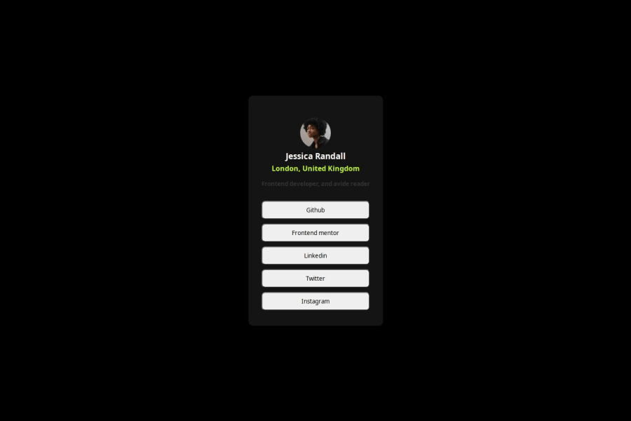
Design comparison
Solution retrospective
My HTML5 and CSS3 structure
Community feedback
- @AdrianoEscarabotePosted 4 months ago
Hello KABORE, how are you? I was really pleased with your project, but I’d like to offer some advice that might help:
To enhance the semantics of your code, consider using a
<ul>(unordered list) for the collection of links, as it represents a list of related items. Here's an example:<ul> <li><a href="#">GitHub</a></li> <li><a href="#">Frontend Mentor</a></li> <li><a href="#">LinkedIn</a></li> <li><a href="#">Twitter</a></li> <li><a href="#">Instagram</a></li> </ul>Using a
<ul>provides clear structure and context, signaling to both browsers and assistive technologies that these links are part of a cohesive group, improving both accessibility and readability.The rest is spot on.
Hope it’s helpful to you. 👍
Marked as helpful0@rayagnewendePosted 4 months ago@AdrianoEscarabote thank you for your feedback.You're right, I forgot to add the links in my list. thanks for your suggestion.
1 - @stezorPosted 4 months ago
Hi. In my opinion there's plenty left to improve here, from html semantic structure to css selectors. For example social links are clearly group of links to other platforms, so unordered list with links inside ( ul>(li>a)*5 ) is the way to go I think. (Styled as buttons obviously). Even tho this project is really small I think regardless it's still best practice to use classes to target and style elements on the page opposed to element selectors, they are most general and slowest for that reason. Also both colors and font need more work so keep at it and best of luck.
Marked as helpful0 - @rayagnewendePosted 4 months ago
Thanks for your feedback. your comments are pertinent. i'll improve my code.
1
Please log in to post a comment
Log in with GitHubJoin our Discord community
Join thousands of Frontend Mentor community members taking the challenges, sharing resources, helping each other, and chatting about all things front-end!
Join our Discord
