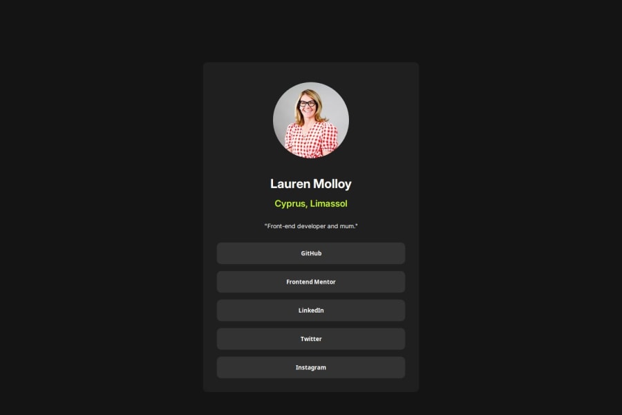
Design comparison
Solution retrospective
I am proud of organising my work flow in a methodical way. I was able to plan the sections easily and them implement it with the HTML and CSS. I have tried to use semantic HTML and CSS variables. Working without designs with px on for reference is something I also need to improve. I have a hard time matching the design with the solution perfectly.
What challenges did you encounter, and how did you overcome them?I think the challenge for me this time was ensuring the project was responsive. I need to practice using media queries more and look at other ways to make design responsive.
What specific areas of your project would you like help with?I would like help with how to work more accurately to match the solution. Is it just a case of trial and error when you don't know the specific measurements/sizes?
Community feedback
Please log in to post a comment
Log in with GitHubJoin our Discord community
Join thousands of Frontend Mentor community members taking the challenges, sharing resources, helping each other, and chatting about all things front-end!
Join our Discord
