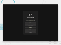
Design comparison
SolutionDesign
Community feedback
- @LuisVera1Posted 7 months ago
Hi @Tashh93
First of all, I recommend you write some comment in your solution, if you have questions is the right place to expose them.
Second, the correct link to your solution is this: Social-links,
Finally, here are some suggestions.
- Use
<a>for links. - It is not necessary to apply styles to the
<html>selector, you can do that in<body> - Use flexbox to center the card, don't use margins or padding, it won't work on many screen sizes.
Check out the following link: Social-links and then base
Hope this is helpful!
Good work!
Marked as helpful1@Tashh93Posted 7 months ago@LuisVera1 Thank you so much. I'll take this into consideration when readjusting my work.
0 - Use
Please log in to post a comment
Log in with GitHubJoin our Discord community
Join thousands of Frontend Mentor community members taking the challenges, sharing resources, helping each other, and chatting about all things front-end!
Join our Discord

