

Design comparison

Community feedback
- P@Aleji0309Posted about 1 month ago
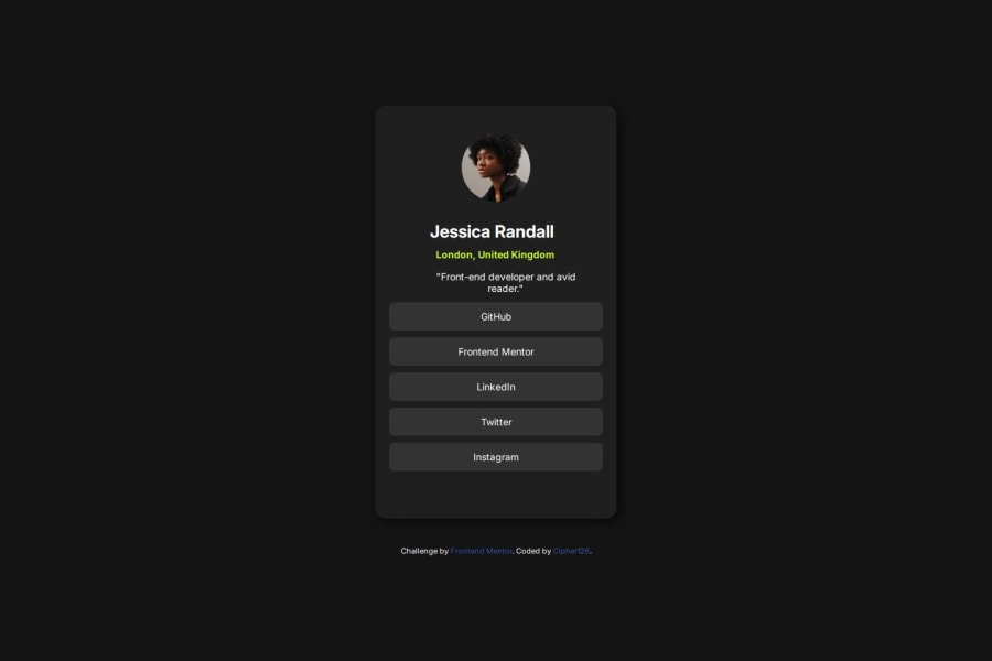
Areas for Improvement: Profile Name (<h1>): The name “Jessica Randall” is placed within an <h1> element, which is good for importance and SEO, but it could be more specific. For a single person, it might be better to wrap the name in an <article> element, signifying that this is a standalone piece of content about Jessica.
Missing <header>: The profile section could benefit from a <header> tag around the name and other introductory information, which would make the structure clearer.
Social Links: While the social links are placed inside a <section>, they would be even more semantically accurate if placed inside a <nav> element, as they are navigation links.
The <footer>: The footer uses the <footer> element correctly, but the attribution could benefit from being wrapped in a <p> tag or similar, for better text grouping.
CSS Inline Styles:
The style tag for the attribution in the HTML head is not ideal. For better organization and maintainability, it’s better to move those styles into the main external CSS file (style.css).
CSS Specificity and Redundancy:
The CSS is mostly well-organized, but some selectors could be made more specific to avoid unnecessary redundancy. For example, the .textContainer h1 and .textContainer .london selectors have margin-right defined multiple times, which might be better consolidated or adjusted.
CSS Variables:
Using CSS variables for commonly used values like colors or font sizes could make the code more reusable and easier to maintain.
Suggestions for Improvement: Refactor Inline Styles:
Move the inline styles in the
0

Please log in to post a comment
Log in with GitHubJoin our Discord community
Join thousands of Frontend Mentor community members taking the challenges, sharing resources, helping each other, and chatting about all things front-end!
Join our Discord