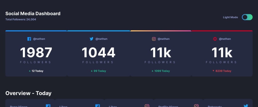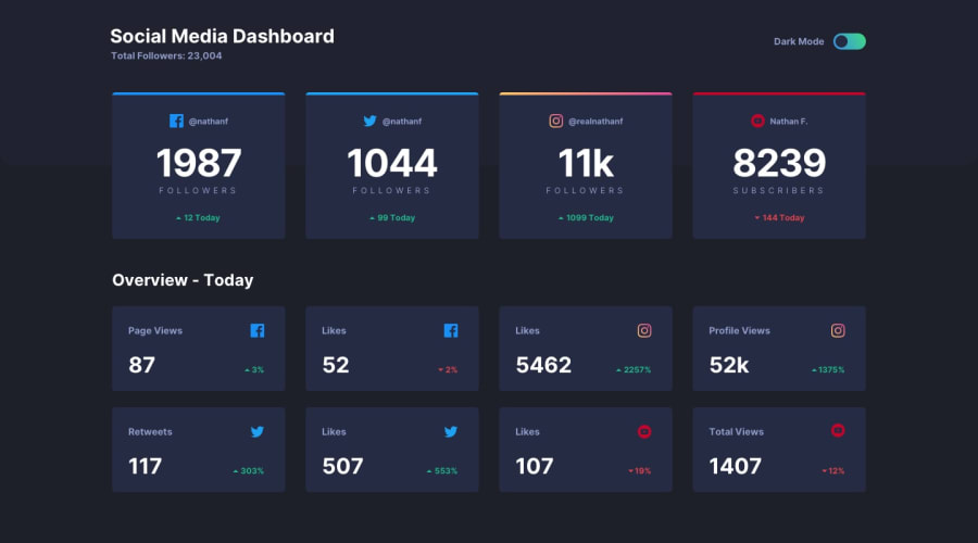
Design comparison
Solution retrospective
Hello everyone! This is my second FrontEnd Mentor challenge. I'm trying to be more comfortable with Vue.js so... I made this.
Feel free to give me feedback!
Community feedback
- @En-JenPosted over 4 years ago
Hey there, nice job on your 2nd FM challenge!! It looks really nice on both desktop and mobile and the theme switcher works really well. I just have a few minor suggestions for you.
-
It would be nice if on tablet screen widths if the cards were laid out in two columns instead of having the columns jump from four to one at 1220px.
-
In the design it shows that when you hover over the switcher in light mode, the pill-shaped part of the switcher should change to the linear-gradient.
-
The design also shows that on hover all the cards should show a pointer cursor and change their background color slightly.
Other than that everything looks great!
1 -
Please log in to post a comment
Log in with GitHubJoin our Discord community
Join thousands of Frontend Mentor community members taking the challenges, sharing resources, helping each other, and chatting about all things front-end!
Join our Discord
