Design comparison
Community feedback
- @Abbas-CodesPosted over 2 years ago
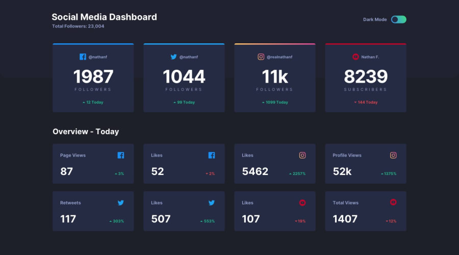
The switch should be at the right when it's light mode, and at the left when it's dark mode
1@J-RaylnPosted over 2 years ago@Abbas-Codes According to the design file, this is true, however based on some research, I made a choice to place the "off" position to the left and the "on" position to the right.
According to the design, the text next to the toggle reads "Dark Mode" which to me implies that the toggle switch should represent the state of "dark mode." In other words, when dark mode is being used, the toggle should be "on" and when light mode is being used the toggle should be "off."
In researching toggles, it is generally accepted that "off" is displayed with the button to the left and the coloring to be muted or plain, while "on" is displayed with the button to the right and the color scheme brighter.
1@Abbas-CodesPosted over 2 years ago@J-Rayln Great observation
Looking at the design now this makes sense, since the "Dark mode" is next to the switch we're switching the dark mode on.
Thanks, I'll definitely keep this in mind when I do mine
0
Please log in to post a comment
Log in with GitHubJoin our Discord community
Join thousands of Frontend Mentor community members taking the challenges, sharing resources, helping each other, and chatting about all things front-end!
Join our Discord
