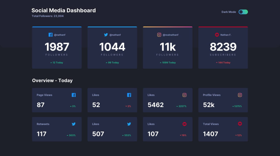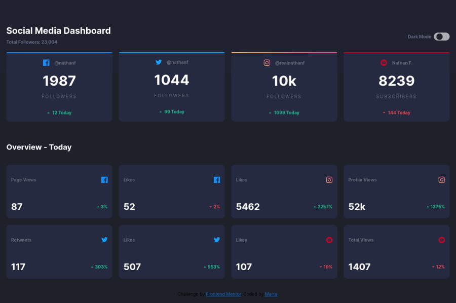
Design comparison
Solution retrospective
Hi, Could you please have a look on BEM I used in the challenge? Does the name of the classes make sense? This is my 3rd project with BEM... Is there any other method how to code a rounded item inside the toggle button? I create <div> inside <button> How can I move the content to the middle of the page without cutting the top grey background on right and left side?
I would appreciate any feedback from you.
Thank you and Happy Christmas for all of you :)
Community feedback
- @ApplePieGiraffePosted almost 4 years ago
Hey, Marta! π
Merry Christmas! π And nice job on this challenge! π
I think your BEM looks fine! Perhaps
box__small
could bebox--small
, thoughβsince "small" seems more like an adjective (and therefore, a modifier rather than an element ofbox
)βbut that's a small thing! πSimply follow the helpful suggestions given by the others and I think you'll be good to go! π
Keep coding (and happy coding, too)! π
1 - @abhik-bPosted almost 4 years ago
Hi Marta, Good job on this challenge ! I really liked it π―
Just some opinions ~
- giving
width
to a element and then givingmargin: 0 auto
can easily center that element on X-Axis with respect to parent element - you can use a pseudo-element for white circle, make
details__btn
haveposition:relative
, then give that pseudo element aposition absolute ; top:50%; transform:translateY(-50%)
to center it on y axis - then you can
transform:translateX(some-value)
to move the toggle button
Happy Christmas π₯³
1 - giving
- @iMervinCPosted almost 4 years ago
Great job! Looks great!
To center your content just add
{margin: 0 auto}
to your wrapper and apply the background color to the body.Add check this out too. Might help with your toggle. (https://codepen.io/designcourse/pen/OGVZjr)
1
Please log in to post a comment
Log in with GitHubJoin our Discord community
Join thousands of Frontend Mentor community members taking the challenges, sharing resources, helping each other, and chatting about all things front-end!
Join our Discord