Submitted over 4 years ago
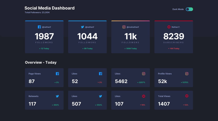
Social media dashboard with theme switcher using Vue
@bestian
Design comparison
SolutionDesign
Solution retrospective
Any feedback are welcome! ^_^
Community feedback
- @GerbenDolPosted over 4 years ago
Hey Bestian! Your solution looks great!
I think on your next challenge try to really nail the details in the design. For example:
- Make sure the white space (your margins and paddings) match the design
- Make colors match, for example your green text is slightly different compared to the arrow
- You are using a different font
I think learning to work on this next level of details will greatly help you become an even better front-end developer! 💪🏻
1
Please log in to post a comment
Log in with GitHubJoin our Discord community
Join thousands of Frontend Mentor community members taking the challenges, sharing resources, helping each other, and chatting about all things front-end!
Join our Discord
