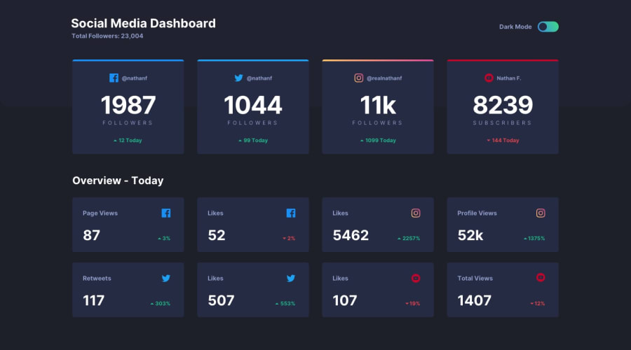
Social media dashboard with theme switcher using TailwindCSS
Design comparison
Solution retrospective
Hello there!
Here are the enumerated answers you requested:
I was initially unfamiliar with the TailwindCSS tool, so it took me some time to grasp how it functions. I found configuring the colors using only HSL to be a bit confusing at first. However, after some effort, I managed to figure it out, and it worked well in the end.
Perhaps the component structure or the layout of the page could have been improved. In hindsight, I think I should have allocated more time to organize and arrange the elements on the page more effectively.
Regarding TailwindCSS, I'm not entirely certain if I implemented it correctly. Therefore, I would greatly appreciate any suggestions or recommendations regarding any of the technologies used in this project.
Thank you in advance for your valuable time and assistance.
Community feedback
Please log in to post a comment
Log in with GitHubJoin our Discord community
Join thousands of Frontend Mentor community members taking the challenges, sharing resources, helping each other, and chatting about all things front-end!
Join our Discord
