Social media dashboard with theme switcher solution

Solution retrospective
A new challenge was solved today using Tailwindcss.
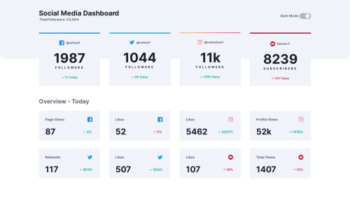
I got stuck on an issue that was not requested in the design. When the theme is in dark mode, the YouTube logo takes the dark background which makes it not look good. So, I applied a white background for the YouTube logo even in dark mode for the last card div. I did this by nesting the icon inside the span element.
However, I faced a problem which I could not solve. There is a white border on the top left corner which I could not remove. This white border appeared from all sides, but I applied a border with the same dark background color around the element. This trick partially solved the problem for me.
I would appreciate it if anyone could tell me how to remove this white border around the image.
Note: Please check the icon on the last card on the page where the problem exists.
Any feedback would be highly appreciated.
Please log in to post a comment
Log in with GitHubCommunity feedback
No feedback yet. Be the first to give feedback on Mohammed Fakih's solution.
Join our Discord community
Join thousands of Frontend Mentor community members taking the challenges, sharing resources, helping each other, and chatting about all things front-end!
Join our Discord