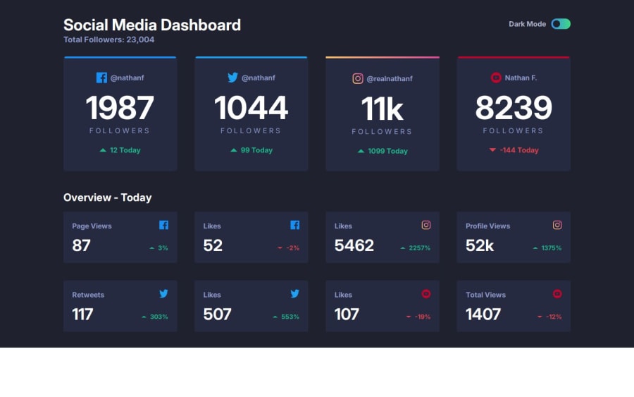
Social media dashboard with theme switcher | React & TailwindCSS
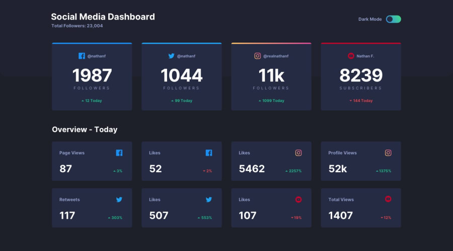
Design comparison
Solution retrospective
In this project, I used CSS Grid instead of Flexbox for styling the stat cards, which offered more control over the card layout and made it easier to create a responsive design.
I learnt a lot about theme toggling functionality, but I'd like to see how others implement it.
What challenges did you encounter, and how did you overcome them?My biggest challenge was actually adding the gradient color borders. I tried to implement it using TailwindCSS, but then I realized it was not easier than traditional CSS for this particular task, so I decided to add the gradient styling directly in the stylesheet.
What specific areas of your project would you like help with?Some things on top of my mind:
- Overall file structure - Oftentimes I am quite unsure if I should put a specific file here or there. Is my current setup efficient?
- I'd like to see how others implemented the theme toggling functionality - I mostly followed a tutorial for this.
Community feedback
Please log in to post a comment
Log in with GitHubJoin our Discord community
Join thousands of Frontend Mentor community members taking the challenges, sharing resources, helping each other, and chatting about all things front-end!
Join our Discord

