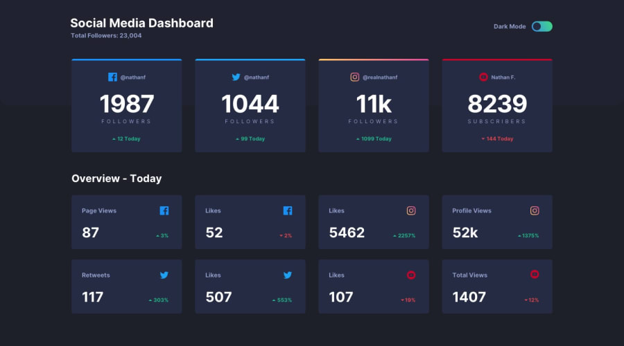
Design comparison
SolutionDesign
Solution retrospective
If u like my work leave a feedback!:)
Community feedback
- @byronbyronPosted almost 3 years ago
Hi @Reandyx
Looks really good!
Few accessibility issues flagged the FE Mentor report:
- Heading levels should only increase by one
- Document should have one main landmark
Both should be fairly easy to fix by making sure your heading start at
<h1>and continue in order. The second issue can be fixed by wrapping all the content in a<main>tag.Your transitions when the theme switches are brilliant!
0@ReandyxPosted almost 3 years ago@byronbyron yeah i know i did good job though thanks for feedback!! :D
0
Please log in to post a comment
Log in with GitHubJoin our Discord community
Join thousands of Frontend Mentor community members taking the challenges, sharing resources, helping each other, and chatting about all things front-end!
Join our Discord
