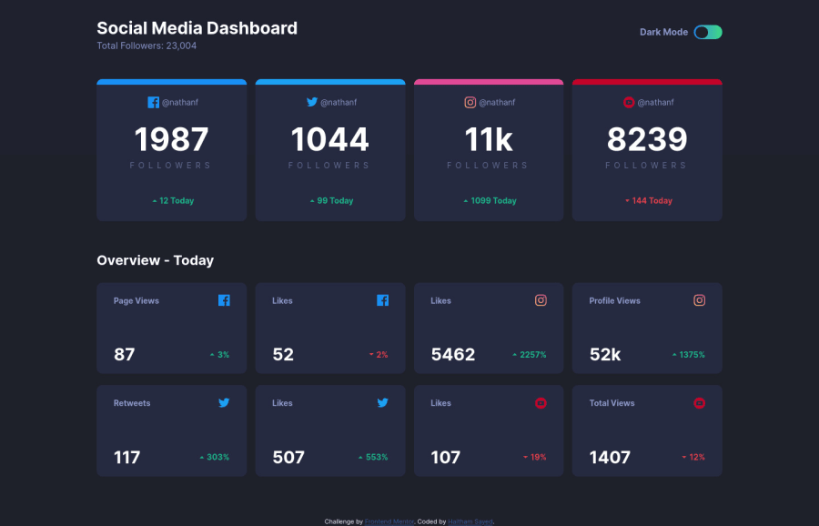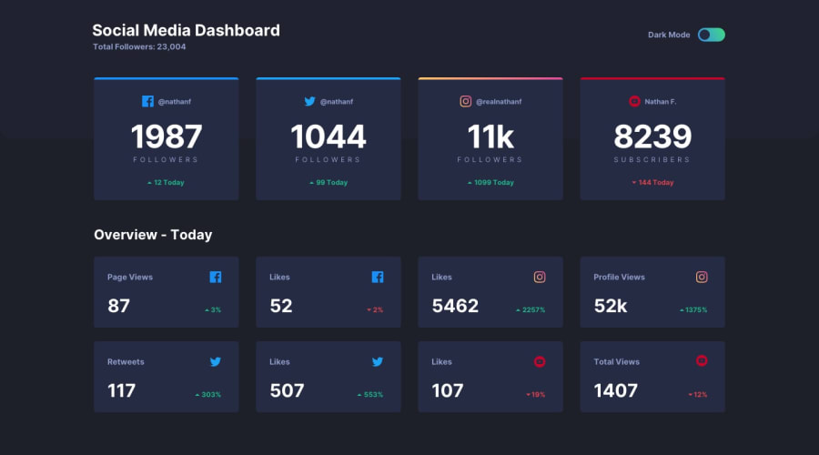
Social media dashboard with theme switcher (modern css, JS)
Design comparison
Solution retrospective
I think this is the best website i made so far, please check my code and any feedback is welcomed <3
Community feedback
- @axevldkPosted almost 4 years ago
Hi, Haitham ~
I have studied your work, and it looks great what you have done on theme switch. Here are some of opinions.
First, you are missing name attributes for checkbox. That's not good for semantic viewpoint. You can add name attribute, even if it's not used seriously.
Second, transition on button looks great, but why didn't you add transition to body also? If you add it to body element, color switching would become more smooth, I think.
Hope my opinion would help you even a bit. Happy coding ~
2@Haitham95Posted almost 4 years ago@axevldk thank you so much that's really boosted me, i will add the transition to the body it will for sure be smoother, and i will add the name attribute, i rarely use checkbox so little i know.
0 - @grace-snowPosted almost 4 years ago
Hi, I really like this!
I'm not sure it will be keyboard accessible and is missing focus state I think? But I'd need to check when on a computer to be sure (I'm on my phone atm).
This solution looks really nice on mobile, transitions are smooth, it's really close to the design and your code is well structured and easy to read.
A suggestion for your css would be to follow best practice in not nesting your css selectors to keep specificity really low. For example, instead of
.header pwhich has a specificity of 11, you could use a single class on that paragraph. Something like.header__subtitle(BEM naming optional!) would have a specificity of 1.Hope that makes sense and is helpful
1@Haitham95Posted almost 4 years ago@grace-snow its indeed helpful, thank you grace you always helping me and giving me the will to continue doing code.
0 - @grace-snowPosted almost 4 years ago
I think this challenge is really hard for beginners when it comes to semantic html too, because the order of content needs changing for proper semantics.
Take this example:
<h2>1987</h2>
<p>Followers</p>
Hopefully you can see that the number doesn't make sense as a heading, even though it comes first visually. Therefore, in the html, I would have
Followersin the heading tag at the top of the card. I would then make the card into a flex column and use the css order property to change the order of its content (give heading order 2, number order 1 etc).I would definitely suggest you revisit your alt text throughoit this solution too. Alt text that just says
icondoesn't mean anything.- So if it is an icon that isn't needed, hide it from assistive technology by leaving the alt attribute empty like
alt="" - Some of the icons ARE meaningful though, like the ones showing an increase/decrease. Those images should have alt text that says that. Screenreader (or similar) users would still want that information.
I hope all thats helpful, I know it's a lot of info! 😂
0@Haitham95Posted almost 4 years ago@grace-snow i understood what you mean and yea thats actually make sense, i will invest in semantic html more thinking next time.
0 - So if it is an icon that isn't needed, hide it from assistive technology by leaving the alt attribute empty like
Please log in to post a comment
Log in with GitHubJoin our Discord community
Join thousands of Frontend Mentor community members taking the challenges, sharing resources, helping each other, and chatting about all things front-end!
Join our Discord
