Design comparison
SolutionDesign
Solution retrospective
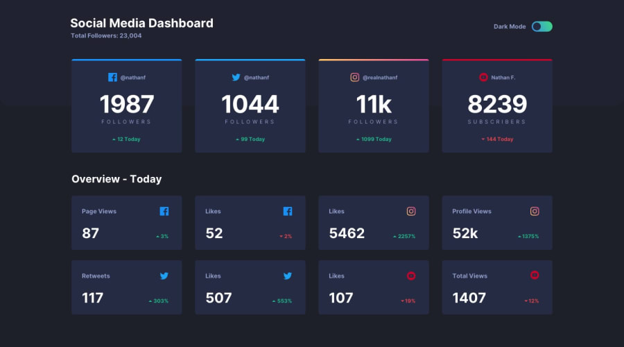
Hi, in this challenge was quite tricky to create border-top with linear-gradient for instagram card.
Sometimes I have problem with colors. Do you have calibrated monitors or not. Because when I check design and use colors in style guide so they look different. Do you have it same?
L.
Community feedback
Please log in to post a comment
Log in with GitHubJoin our Discord community
Join thousands of Frontend Mentor community members taking the challenges, sharing resources, helping each other, and chatting about all things front-end!
Join our Discord
