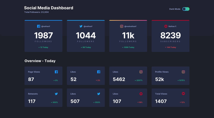
Design comparison
Solution retrospective
any suggestions for improvement are welcome
Community feedback
- @dylan-dot-cPosted 7 days ago
This is a great solution but I see a place where you missed out on something important, CSSGRIDS!!!
I see you used flex for the containers and nothing is wrong but CSS GRID is actually more controlled and predictable in these cases. So for example on my laptop the followers count is actually in 2 rows, 3 in the top and 1 in the bottom. If you used grid you can make it 4 columns and all laptop+ screen sizes, for tablets you can make it 2 columns and for mobile 1 column. The same goes for the other section. While flex is decent and can get you the layout quickly, it won't help for all screen sizes, as some will be like mine and if you want to have it fully controlled grid would be the best option here.
Also try not to set fixed heights on containers, just let the contents decide the height, you can limit the heights with
max-heightbut other than that let it be natural.ALso you might want to add a max-width as well so that it doesn't extend cross a certain size and have all or more than 4 in a row(like 2000px+).
Marked as helpful0@Yashbabani0Posted 6 days agoHey Dylan,
Thanks again for your detailed feedback! I really appreciate it.
You’re right I did't considered using Grid for the layout, and I can see how it would provide more control, especially across different screen sizes.
I’ll revisit the layout and switch it to a responsive grid, using 4 columns for larger screens, 2 columns for tablets, and 1 for mobile. That way, it will be much more consistent and adaptable!
Also, good point about avoiding fixed heights. I’ll adjust the containers to use max height where needed, but otherwise, let the content flow naturally. Adding a max-width is a great suggestion too. I’ll make sure to prevent the layout from stretching too wide on ultra-large screens.
And thanks to your suggestion, I revisited the website and noticed that on toggle, the "Overview - Today" section color wasn’t changing correctly. I haven’t fixed it yet, but it’s on my radar now, and I'll address it soon.
Thanks again for all your insights! 😊
1
Please log in to post a comment
Log in with GitHubJoin our Discord community
Join thousands of Frontend Mentor community members taking the challenges, sharing resources, helping each other, and chatting about all things front-end!
Join our Discord
