Design comparison
SolutionDesign
Solution retrospective
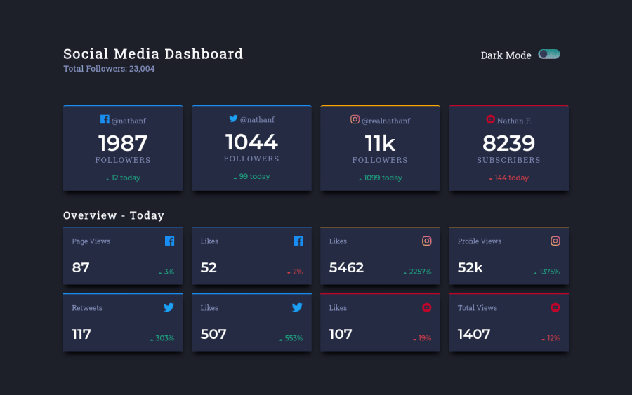
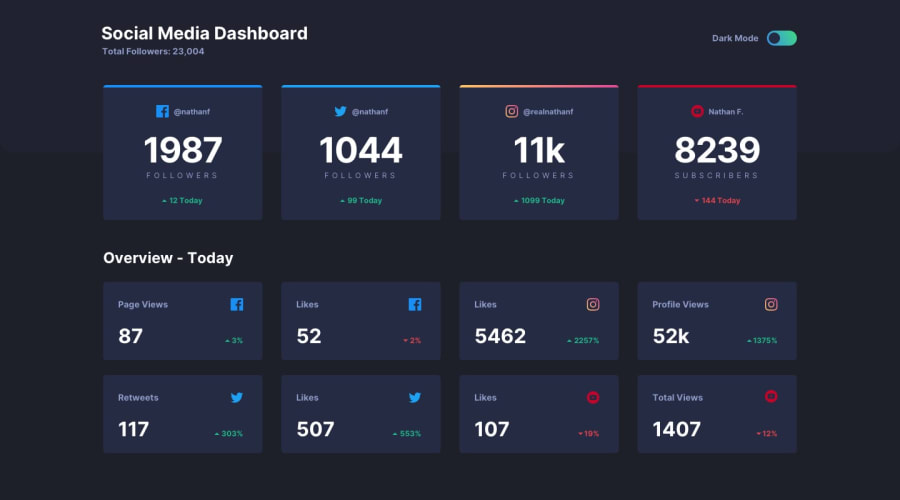
A fun challenge to build grid skills with a little bit of JS. I have never built a project with a dark mode theme toggle before so that was a fun challenge. I added a little bit to the project with some box shadows for the media cards and some transformation on hover.
Community feedback
Please log in to post a comment
Log in with GitHubJoin our Discord community
Join thousands of Frontend Mentor community members taking the challenges, sharing resources, helping each other, and chatting about all things front-end!
Join our Discord
